
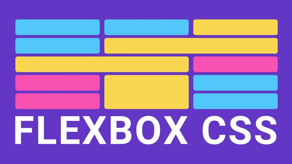
Creating a Responsive Web Design with CSS Flexbox
Responsive web design is no longer a luxury—it’s a necessity. As the variety of devices people use to browse the internet expands, so does the demand for websites that adapt seamlessly to any screen size. From smartphones and tablets to laptops and desktops, your website needs to provide an optimal viewing experience on all of them. That’s where CSS Flexbox comes into play.
Flexbox (short for “Flexible Box Layout”) is a layout model in CSS that makes it easier to design responsive and efficient layouts without relying heavily on floats or complicated media queries. Whether you’re building a basic blog or a complex web app interface, mastering Flexbox will give you the control you need to create adaptive layouts that just work.
Let’s explore what Flexbox is, why it’s effective for responsive design, and how to use it step-by-step.
What is CSS Flexbox?
CSS Flexbox is a layout module that allows you to align and distribute space among items in a container—even when their size is unknown or dynamic. It was designed specifically to improve item alignment, spacing, and layout control in one-dimensional layouts (either rows or columns).
With Flexbox, you define a parent container (display: flex) and apply layout rules to the container’s children (known as flex items). It’s highly efficient for:
- Vertical and horizontal centering
- Distributing space evenly
- Reordering items visually without changing HTML structure
- Creating equal-height columns
Let’s take a closer look at how to use Flexbox for responsive design.
The Flex Container and Its Properties
To begin using Flexbox, define a container element and apply display: flex (or display: inline-flex) to it. Once that’s done, all direct child elements become flex items.
This small declaration sets the stage for a powerful and flexible layout system. The container can then use several properties to control the layout:
flex-directionflex-wrapjustify-contentalign-itemsalign-content
Let’s break these down.
flex-direction: Setting the Main Axis
This property defines the direction in which the flex items are placed.
row(default): Items are placed from left to right.row-reverse: Items go from right to left.column: Items are stacked vertically, top to bottom.column-reverse: Items are stacked bottom to top.
Choosing the right direction is essential for controlling layout responsiveness—especially when paired with media queries or viewport units.
flex-wrap: Handling Overflow
Flex items typically try to fit into one line. With flex-wrap, you can allow them to wrap onto multiple lines:
nowrap(default): All items are on one line.wrap: Items wrap to the next line.wrap-reverse: Wraps items in reverse order.
When combined with flexible widths (like percentages or flex values), this property ensures that your layout won’t break when the screen size changes.
justify-content: Aligning on the Main Axis
This property controls how flex items are positioned along the main axis (horizontally for flex-direction: row).
Options include:
flex-start: Aligned to the start.flex-end: Aligned to the end.center: Centered.space-between: Evenly spaced with the first item at the start and the last at the end.space-around: Equal space around items.space-evenly: Equal space between and around items.
This is incredibly useful for creating evenly spaced navigations, icon rows, or content grids that adjust automatically.
align-items and align-content: Cross Axis Alignment
While justify-content works along the main axis, align-items controls the alignment on the cross axis (perpendicular direction).
stretch(default): Items stretch to fill the container.flex-start: Aligned to the start of the cross axis.flex-end: Aligned to the end.center: Centered.
align-content is used when there’s extra space in a multi-line layout. It behaves similarly to justify-content, but on the cross axis.
Flex Items: Controlling Individual Elements
Once the container is set, you can fine-tune individual items using the following:
flex-grow: How much an item should grow relative to others.flex-shrink: How much it should shrink when needed.flex-basis: The initial size of the item before growing or shrinking.flex: A shorthand for the three above:flex: grow shrink basis.
Example:
.item { flex: 1; }This means all items with flex: 1 will grow or shrink equally to fill available space. Want one item to be twice as big? Use flex: 2.
You can also override positioning using:
align-self: Align an individual item differently from others.order: Change the visual order of items without modifying the HTML structure.
Building a Responsive Layout with Flexbox
Let’s put all of this into practice with a basic responsive layout example.
HTML
CSS
.container { display: flex; flex-wrap: wrap; justify-content: space-between; } .box { flex: 1 1 30%; background: #eaeaea; margin: 10px; padding: 20px; text-align: center; box-sizing: border-box; } @media (max-width: 768px) { .box { flex: 1 1 100%; } }In this layout, the .box elements take up roughly a third of the container’s width on larger screens. On smaller screens (under 768px), they stack vertically and span 100% width. This combination of flex, wrap, and media queries creates a seamless experience for any device size.
When to Use Flexbox (vs. Grid)
CSS Grid and Flexbox are often mentioned together, and while they serve similar purposes, they are best used in different situations.
Use Flexbox when:
- You’re laying out items in a single direction (row or column).
- You want natural content wrapping.
- You’re building navigation bars, cards, media objects, or input groups.
Use Grid when:
- You need to manage two-dimensional layouts.
- You have complex placement requirements.
- You want more control over both rows and columns simultaneously.
That said, the two systems can complement each other. It’s common to use Flexbox inside Grid areas for additional alignment control.
Common Flexbox Use Cases in Responsive Design
Navigation Menus
Using Flexbox makes horizontal navigation bars easy to build, space out, and wrap on smaller screens.
.nav { display: flex; justify-content: space-between; flex-wrap: wrap; }Equal-Height Cards
Flexbox naturally supports equal-height columns, which used to be tricky with floats.
.card-container { display: flex; align-items: stretch; }Vertical Centering
Gone are the days of relying on absolute positioning hacks. Flexbox makes vertical alignment straightforward:
.centered { display: flex; justify-content: center; align-items: center; }Split Layouts
Need a two-column layout with equal spacing and responsive behavior?
.split { display: flex; } .split > div { flex: 1; padding: 20px; }Add flex-wrap and media queries to stack these columns on smaller screens.
Best Practices for Responsive Flexbox Design
- Use percentages or
flexunits instead of fixed pixel widths. This keeps your layout fluid and adaptable. - Combine with media queries. Flexbox does a lot on its own, but media queries help you fine-tune layouts for specific breakpoints.
- Avoid using too many nested flex containers. While Flexbox supports nesting, too much complexity can make maintenance harder.
- Test on real devices. Emulators help, but always check how your Flexbox layouts behave on actual phones and tablets.
- Add
box-sizing: border-boxglobally. This ensures padding and borders are included in the element’s width and height.
Wrapping Up
Responsive design is essential for modern websites, and CSS Flexbox provides an intuitive, powerful toolkit to make it happen. It’s not just about making things fit the screen—it’s about ensuring that every user, on every device, gets a well-structured and aesthetically pleasing experience.
With a solid grasp of Flexbox principles, you can confidently design responsive layouts that adapt, scale, and feel natural—whether you’re building a personal blog, an e-commerce storefront, or a mobile-first web application.
If you haven’t yet embraced Flexbox in your workflow, now’s the time. It’s one of those tools that, once mastered, makes everything else easier.